𝐀𝐛𝐨𝐮𝐭 𝐭𝐡𝐞 𝐁𝐫𝐚𝐧𝐝
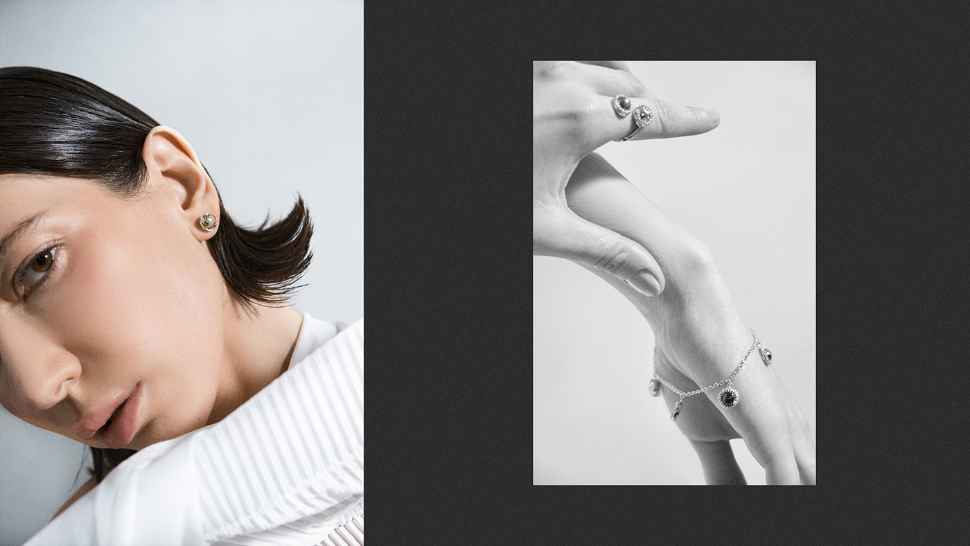
Inspired by nature, BUUNT, the world leader in fine jewelry, presents a unique and rare collection of designs.
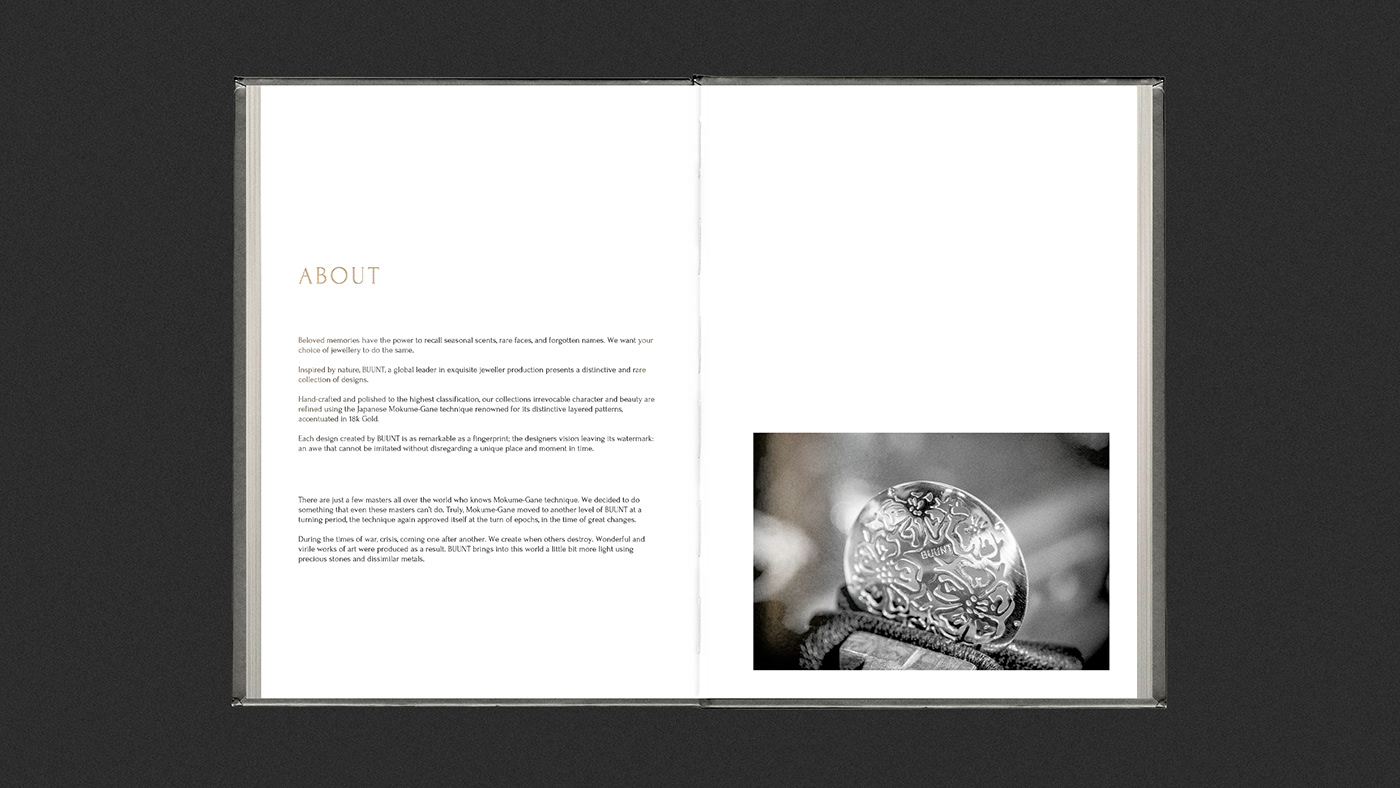
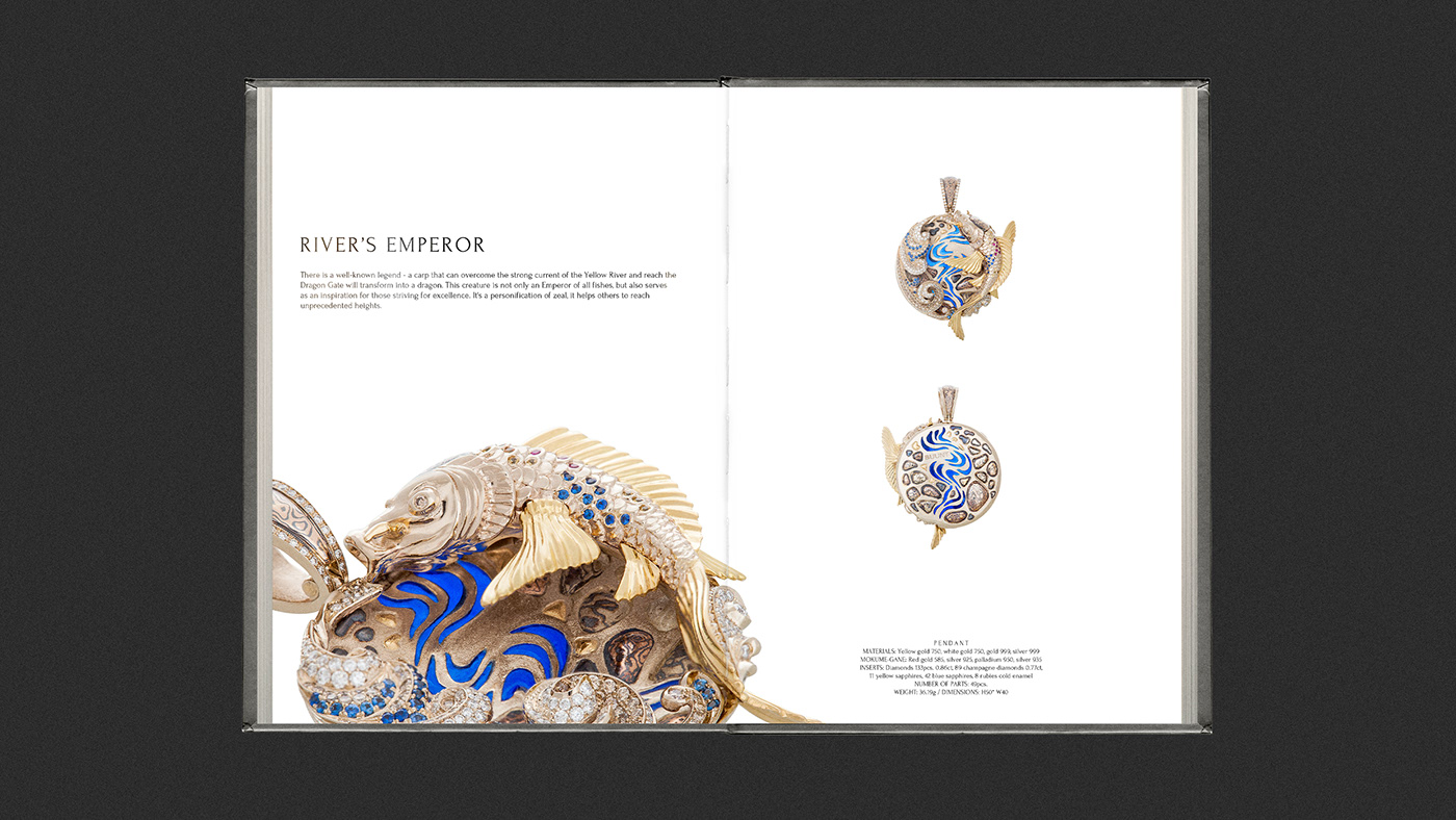
Using the exquisite Japanese technique of Mokume-Gane, known for its characteristic multi-layered patterns. This is a technique of working with metal that has a 300-year history.
The essence of the method is that several sheets of different jewelry metals, including yellow, white and red gold, palladium, silver, copper, with different thicknesses and colors, are stacked in a certain sequence. They are heated at a certain high temperature so that the metals are sintered together, forming an indissoluble bond. Then the craftsman forms the pattern using various tools and, depending on the desired result, it can be either classical or geometric, etched or with the use of patina. Each pattern is unique and inimitable.
𝐒𝐨𝐥𝐮𝐭𝐢𝐨𝐧
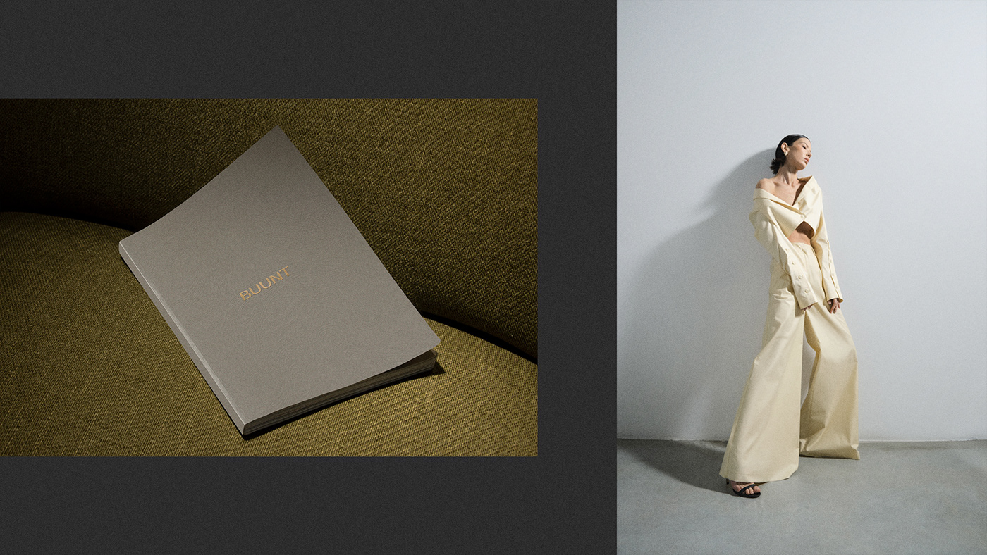
The brand already had a unique visual component. It only needed to be properly conveyed to the end consumer.
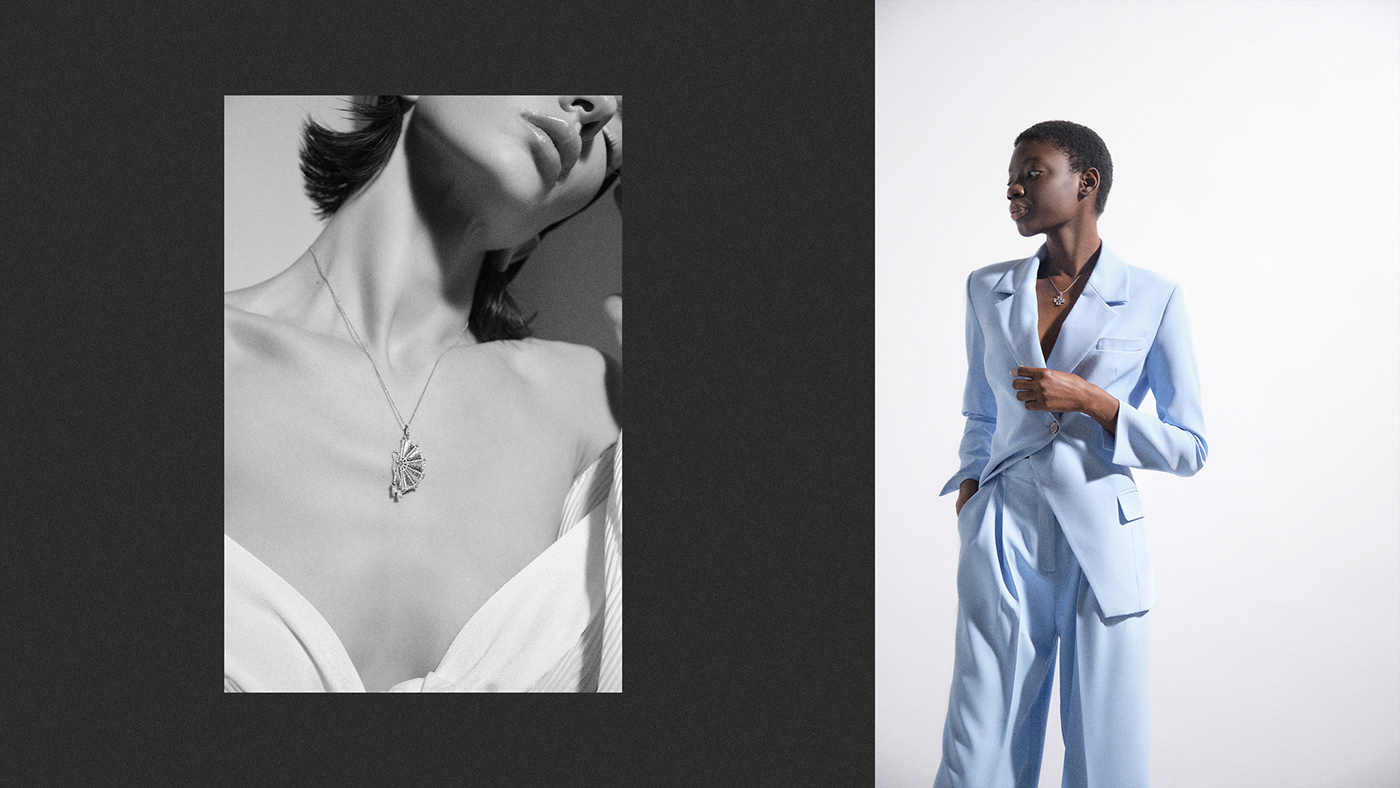
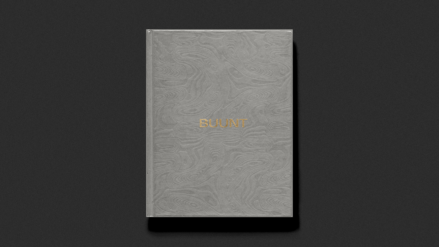
Unique patterns are present in every product, we scaled them and created a pattern. It formed the basis of Buunt's style and branded paper, and was integrated into the brand's products.
We simplified the logo, made it more minimalistic, leaving only the text part, and removed unnecessary elements. Japanese culture and the Wabi-sabi style formed a new approach to color. The main shades were moved to a more neutral spectrum, which emphasizes the premium nature of the product and its strengths.
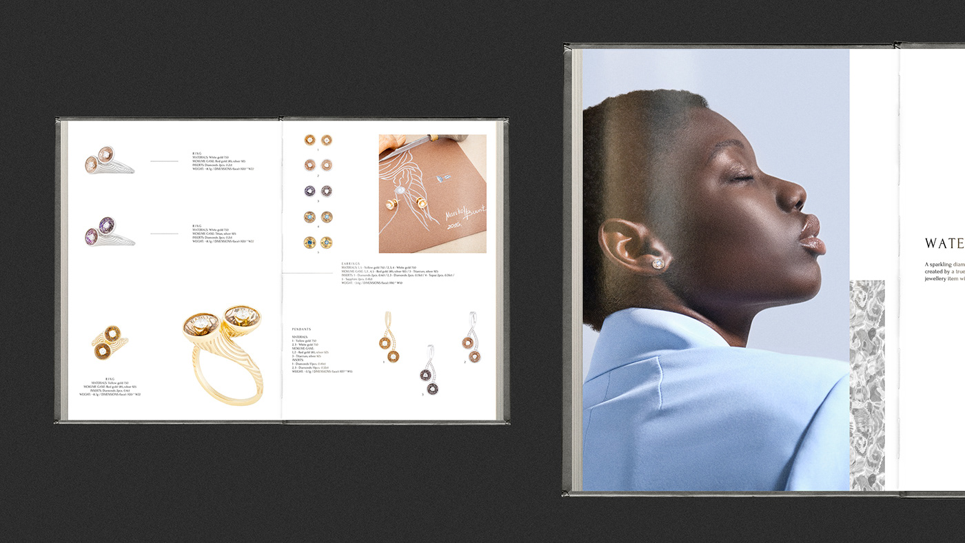
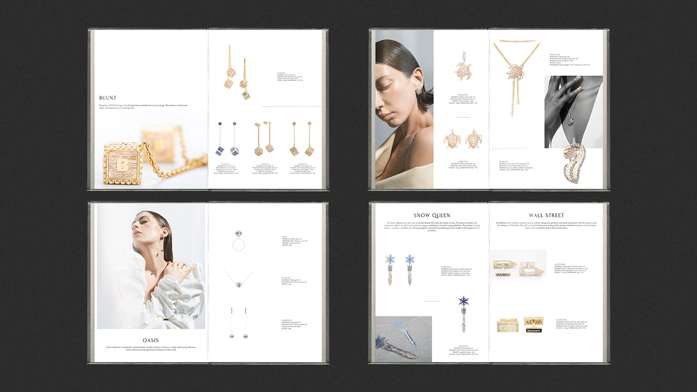
The work on preparing the content for the presentation catalog also took into account the new approach with a vector for minimalism and simplicity. A new color palette was used with an emphasis on the brand's products.